Saturday, January 28, 2006

1 year - match.com


you guessed it. it's been 1 year since i received a "wink" from jerry on match.com. i thought about just ignoring his wink, but sent him a response email asking what it was about my profile that he found interesting (thinking that he probably couldn't even respond).

i was proven wrong, though, as he responded w/ a very good answer. also shown is his 1-yr reminder letter to me about how happy/lucky/fortunate that he "found" me, made that first move (which he claims he almost didn't b/c he thought i was so out of his league), and made the effort to build/maintain a serious, fulfilling relationship.

our wedding date is set for february 14, 2006.

Thursday, January 26, 2006

the middle of nowhere


this is a picture of the back of my van. i live on a gravel road and have a 3 mile drive each morning before hitting the highway. needless to say, my car is always covered w/ a fine to heavy coat of dust unless it's raining. my students at school tease me about it b/c they can always spot my car in the parking lot -- it's the one w/ the dusty back window. amazingly, the people who live in the country and on gravel roads seriously consider what color of car to get b/c of how it will "show dust".

a couple years ago when i went to see lee greenwood in concert (proud to be an american), there was a young up-and-coming country star there as the opening act -- brian mccomas. he was so much fun and so talented and so memorable. he sang a song, which has now been released, about the things that happen in "the middle of nowhere". having grown up in the country, i could totally relate to that song the second i heard it. if people only knew what kids/people do "out in the middle of nowhere" and on "those old dirt roads" -- they would be much more careful about where their kids go.

anyway, i've had plenty of messages left on my car for me before, but i have to admit that this one was the funniest. and to think that some people worry and/or get all upset when a cat walks on their car!

the dukes of hazzard


actually, i was dreading this day. i didn't ever want to see the dukes of hazzard movie myself as i had enough of the dukes when i was 10 or so. yeah, it was a fun show then and i liked it, but watching it now was really cheesy! problem was -- i had a teenage boy that really wanted the movie for his own collection. i almost didn't buy it for him b/c i knew i would end up having to watch it, but those are just the types of sacrifices that a mother makes for her children's happiness!

so, here we were, spending an evening at home w/ family, getting ready to eat dinner, when scott said, "so what movie are we watching?" w/o any hesitation for anyone to squeeze an answer in there, he said, "how 'bout dukes of hazzard?" i did a mental eye roll, but i agreed. i brought my journal and colored pencils in there w/ me, though, so at least i could make sure i was entertained. when raven saw that i had the colors out, she insisted on sitting on the arm of the chair and reaching over me to color.

we had a wonderful evening -- coloring and watching tv. raven loves to "write" and to "color", but this night she was practically attacking her page w/ such energy. i would love to know what she thought in her mind that she was writing down on her page. then again -- maybe i'm better off not knowing those things!


waiting


this is just a little journal entry i drew and piddled with the other night while i was waiting on jerry to get done at work and come and pick me up. we usually ride to work together a couple days a week. it doesn't really save us much mileage and it usually makes us rearrange our schedules a little bit, but we do get to enjoy each other's company for 50 minutes in the morning and then 50 minutes that evening. it's a good thing overall and helps us stay more connected. i guess i'm so used to having to wait on things some times that i don't see it as wasted time, but time to do something that i wouldn't have taken time to do later when i was needing to do other things. some times this just forces me to take a breather.

Tuesday, January 24, 2006

raven's playhouse

here is a project that jerry and i did last summer -- july, 2005. what i found interesting about this project is that it was the first "work project" that we had done together. we liked spending time together and like doing things together, but working together is sometimes a very different situation.

so here is how the situation came about -- we had been at vacation bible school all week, and raven had been in my class for the 3 & 4 year olds, even though she wasn't yet 2. for rainy days or indoor playtime in case it got too hot outside, the director of games had built a huge castle/maze/ski ball/house play area about 35 x 30 out of cardboard that she got at the recycle center. raven was so intrigued by "playing house" in the little, plain brown cardboard box w/ windows and door cut in it -- that's what she played w/ every time we went there and she didn't want to leave.

i went shopping to look at playhouses. little tyke houses ranged from $200 - $600, depending on how fancy and how big a person wanted. i didn't have that kind of money to spend, so i had to come up w/ something else.

total cost -- $22, including the purchase of cardboard box, paint, drawer knobs & hinges. total value -- priceless!


Wednesday, January 18, 2006

"sea" - illustration friday topic for 01/06/06


"sea" - illustration friday topic for 01/06/06

well, obviously i didn't get this drawing done on time and that's why it wasn't posted officially! in fact, i wasn't even inspired to do this weekly prompt until i saw a picture of a sea turtle and my first reaction was "wow, that turtle back looks like stained glass." then i thought, "oh, i could do a turtle and some water in a border and make it all look like stained glass, so that's what i did. problem is -- i had no idea how tedious it would be to draw and color in all those little shapes!

i wanted so many color variations rather than just lighter and darker shading of the few colors that i had, so each section is colored or shaded in a color that will slightly alter the color used on top. some were more successful than others, but i think the overall effect turned out good.

i used prang colored pencils on white journal paper that feels rather like cardstock. i sprayed the finished product w/ krylon matte finish, but it seemed to really dull the picture. i used my hand to rub most of the finish off so the picture was still somewhat shiny again.

Sunday, January 08, 2006

relationship update -- final chapter of "jerry's journal"


can you guess what i got for christmas?

we're planning to get married on valentine's day at a small chapel here in pittsburg w/ a small ceremony including our families. this is the relationship that the journal previously shown on this blog was recording. jerry had never had anything special made for him (except a quilt from his mother) so he was extremely impressed and amazed that i had put so much work into something to give him for "no special reason".

he just didn't understand that i did have a very special reason --> him.

in case you didn't guess my gift -- i'll give you a little hint . . . . .


now is the beginning of OUR journal. he's really excited, too, b/c now he doesn't have to wait until the project is totally finished w/ 100 pages of writing and drawing before he gets to see it now! of course he doesn't read my personal stuff, but this would be a book that was about US and for US. he loves reading the other book that i made for him, so i'm sure he be reading bits and pieces of the upcoming book many times over!

jerry's journal cover


here is the finished cover of the comp book journal that i made for jerry, a record of the start and progression of our relationship. for those people who haven't looked at the archives of my blog, the first 45 entries on here (all in october) are pages of artwork from this journal. at the time i posted those, i was almost done w/ this project but just couldn't seem to find the right ideas to finish up the last few pages. then i had "tons" of problems getting the cover done to look the way i wanted it!

the cover is actually much darker/deeper color than shown here, but i had to lighten the scan so you could see the patterns in the tissue. it's also more patterned than it appears here, but i assume that comes from saving the file much smaller to post to the web. the silky shine does not show up thru scanning, but "flashed back" so bad that i couldn't get a good digital picture of it. the lines that appear to run across the cover are small ripples in the multiple layers of tissue. there are probably 6 - 8 layers of tissue on the insides and outsides of the front and back covers of this book, so there were considerable layers to deal w/!

in person, the book reminds of of very dark cherry wood that has a nice age to it -- that deep dark color of port wine. it's not until you view it in the light that you notice the pattern in it as the top layer of burgundy tissue really toned down the red/green/gold paisley christmas tissue layer below it.

the final product consists of layers of tissues attached to the comp book cover using mod podge and the final finish was achieved by "painting" the inside and outside covers w/ 2 not-too-heavy coats of future floor wax. i'm extremely happy w/ the finished product and the way that it has handled the wear since october -- it looks just the same as new!

the butterfly effect

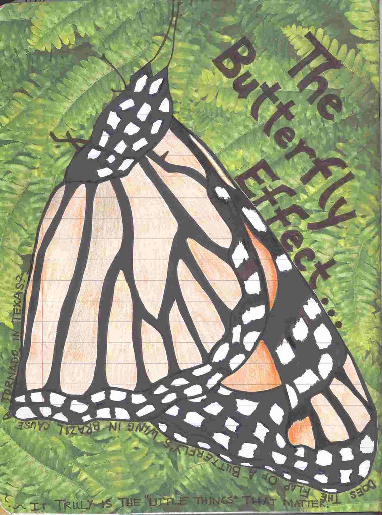
the butterfly effect -- this piece was inspired by a motivational article i read in en email newsletter, but i was amazed at the impact that understanding this mathematical theory made on my life as a whole. when i was considering whether i wanted to bother with a relationship or not and what i was willing to give up and/or sacrifice to have a relationship, i really wondered whether i was the kind of person cut out to actually love someone else who was not my child or a part of my family. for those people, i would give up my life w/o a moment's hesitation. for other people, well -- i don't think so.

i decided that IF i was going to be involved in another relationship, i was going into it expecting to give 100% and to receive 100%. i wanted love, respect, consideration (for myself and my children), etc., and was prepared to offer those same things to someone else. i've always known that it was often the little things that hurt people's feelings and/or caused relationship of all kinds to go sour, but reading and pondering this theory really drove that point home to me.

after all -- if it's just 1 little thing that caused a huge issue and that could've been avoided by being more aware, being more careful, being more considerate, and/or being more loving -- wouldn't it just be better to prevent those situations while they were still small? that's how i truly feel, too, as i know that each day when i see someone or speak to someone, that might be the last time that we ever talk. when parents watch their child walk out the door -- that might be the last time that child ever comes home safely. when spouses leave for work in the morning, anything in the world could happen that day.

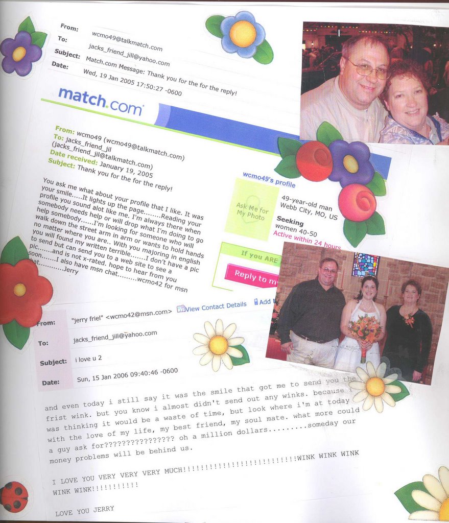
since my son's car wreck in 2002, i am even more aware of how precious life is and how special the people in my life are to me. i never want to live with the idea that the last meeting and/or conversation that i had w/ someone i love was filled w/ anger, harsh words, and/or hurtful actions. so now i am even more conscious that "it's the little things that make the differences in life. the little things can constantly convey how much you love someone or the little things can let other people know how little that you care."

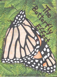
i drew the butterfly on the comp book page w/ black sharpie marker and prang colored pencils. then i decided that i wanted a bolder background that i was probably willing to apply to the page, so i decided to go w/ plants on decorative paper. i used an exacto knife to cut around the top and sides of the butterfly body and left it fully connected to the page by the underside of the body. i measured the decorative papger and cut a slit in the page that matched the shape of the butterfly's underbody. by putting the decorative page on top of the butterfly and then pulling the butterfly's wing up thru the slit, i was able to make the butterfly be on top of the greenery even though i did the butterfly first on the page.

i used mod podge to glue the decorative paper down to the background area of the comp book page and then to glue the butterfly's wing down on top of the greenery. after the pages dried, i went back w/ a black sharpie marker and penned in legs, antennae and the working -- "The Butterfly Effect . . . can the flap of a butterfly's wings in Brazil cause a tornado in Texas?" around the shape of the butterfly and then "It truly is the little things that matter." across the bottom of the page.

if you want to read the article about the butterfly effect, you can find it here --> http://wentupthehill.blogspot.com/2006/01/its-little-things-that-matter.html . that blog is where i keep about 60 or so stories that i've written about my life and/or my thoughts on those events. i need to get back to that more, but i've been too busy making art now!

special date memorabilia - blackhawk pocket


shortly after we met for our first date, jerry got a call to purchase some charity concert tickets to help a children's home in springfield. he thought it was the perfect reason for him to go ahead and buy these tickets, hoping that we would still be dating 2 months later and that i would go with him. i love going to concert and musical events -- even if it's not someone i like b/c i can watch the crowd and just enjoy the excitement of the event. don't worry -- i'm the same way at football games as i go to nfl games to watch the crowd and enjoy the excitement more than to see the games!

i had several pieces of "things" from that night that i wanted to save, so i thought that a pocket was the best method. i had the info sheets about the band, the concert announcement poster, menu from olive garden, our hotel keys, and our concert tickets. i used decorative paper to cover the fronts and backs of 2 comp book pages, riveted them together w/ brass-colored eyelets, folded/glued the front corner down to make the contents visible and added some pen details.

i chose that paper specifically b/c it says "a dreamer lives forever" as a personal joke to jerry. he has given me a hard time in the past b/c he feels that his dreams are "more realistic" than my dreams. i just laughed and told him "that's probably because of our age difference, honey. i have a few more years to get some things done than you do!" and then gaven him a big smile!

not your average cat


on this page, i wanted to remind jerry that i am not just an average person and i am not looking for just an average man or just any man to fill the position of partner. i would rather be happy and single than miserable in a relationship. i want more -- i want it all. if i can't have that, then i would rather do w/o. so jerry has always known that i wanted the best or nothing. if jerry doesn't work out, then rune is next in line! you can see "his" picture here -- http://www.valkyrieriders.com/2004_valkyrie_rune.htm -- as "he" is jerry's only competition now!

the tiger in this picture was on a postcard ad from mizzou and i found the intense blue eye very intriguing and noticeable. this journal page actually took 2 pages in the comp book as i glued the postcard to the page behind this page and then colored some around it just in case i tore the top page too far. then i colored the back of the top page in the area that covered the tiger's face before finally coloring the front of the top page.

i marked where i wanted the "center" of the opening to be and poked a hole in the top page by poking a pencil thru the back of it. i wanted the page tear edges to be easily accessible from the front. then i used mod podge and spread it on the underneath page in all the places that i wanted to stay covered and stuck the pages together.

after the pages dried, i pulled on the torn pieces until they were torn out far enough to reveal the tiger's piercing gaze thru the folage. i rolled the torn edges back and fastened them to the journal page to keep them from getting damaged later and to give this picture/page some depth. unfortunately, that depth doesn't show as much from a photo.

i used prang colored pencils for coloring the leaves in the background and black sharpie marker for the writing/lettering.

Saturday, January 07, 2006

love envelope - caution!

message says -- "CAUTION -- this envelope may contain words of love . . . . " -- i had written jerry a love letter that was inspired by the origami that one of my students left lying on my desk. the paper was intricately folded and then tied w/ a piece of string. i decided that it would make the perfect "package" for a love letter, so i wrote on it and folded it back up the way it was and tied it. it was about 1.5" x 1.5" when folded up, so i was afraid that it would be lost if not contained w/i something, so i opted for an envelope. of course i didn't have an envelope w/ me while working on this, so i had to fold up my own to use!

i inserted this envelope on a page that i was unhappy w/ earlier in the book. i just tore that unsatisfactory page out, leaving a 1" tab. then i folded a 4.5 - 5" piece of striped paper in 1/2 (longwise) and glued to each side of the tab but careful not to glue the paper together out past the tab. after the glue dried, i used the letter opener to cut the folded edge of the striped paper so i could glue the envelope securely there between the 2 edges. i used colorful fiber to tie the flap closed and keep the folded paper held tight.

Thursday, January 05, 2006

a second attempt at flavor -- a comparison


after looking at the grapes that i drew for illustration friday entry of "flavor", i saw some mistakes that i made here and there. while fixing dinner tonight, i decided to have another go at the grapes and see if i could do a better job, softening the lines in the shading while still keeping the colors in the grapes.

i used prang colored pencils on cream-colored 65# sketchpad paper. i added shading in gray and light brown on the background. i think i achieved that softer look on the shading, but i think the grapes in the previous attempt looked more real! oh well -- live and learn and try again! not tonight, though, as i'm about sick of green grapes!

Wednesday, January 04, 2006

"flavor" -- illustration friday topic -- 12/30/05


"flavor" -- illustration friday topic -- 12/30/05 -- #372 at www.illustrationfriday.com

for this week's topic of flavor, i drew a bunch of grapes that we had at our new year's eve party. i couldn't really think of a word that just "screamed" flavor to me, but these grapes were a good example to go with. i worked more on my shading and shaping through the use of color on this piece. i see that my shadow on the counter should have been more blended rather than so defined, but amazingly -- it looked that way in the photo to me!

this is done w/ prang colored pencils on 25# cotton letterhead from work.

Tuesday, January 03, 2006

new year tradition


after some prompting on one of the groups that i'm in, in 2004 we started a tradition to stamp our hands on new years to keep track of how much we change and who we change from year to year. this year's print has jerry's hand on it, as he's new in my life, but it doesn't have my son's gf's print b/c they are no longer together. little raven's tiny print is MUCH bigger than it was last year. we make one all together, overlapping as needed, b/c that symbolizes "family" to me. our family is not made up of individual units, but rather a combination of members. we overlap, we support, we touch, we hold, we love -- we stick together.

then, each smaller family unit makes their own page -- jerry and i made our own and i'll put our picture w/ our hands. summer, lucas, and raven made their own and i'll put their picture w/ their hands. it's a fun way to see how we change over the years, both by adding (or removing) people from our family and by seeing the kids grow. using a permanent marker, each person writes his/her name with his/her handprint -- for future reference. the page is dated to insure that we always know which page goes w/ each year.

on this picture, the black sparkly handprint is jill, the green handprint is jerry, the pink handprint is raven, the bronze handprint is lucas, the gold handprint is summer, and the red handprint is scott. after we stamp our handprint, we then emboss it w/ the color of our choice. each person has to be a little different. this picture is on 11 x 14 65# sketchpad paper.