a second attempt at flavor -- a comparison
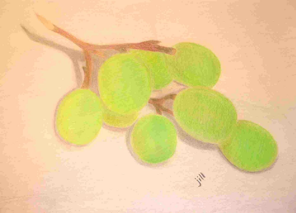
after looking at the grapes that i drew for illustration friday entry of "flavor", i saw some mistakes that i made here and there. while fixing dinner tonight, i decided to have another go at the grapes and see if i could do a better job, softening the lines in the shading while still keeping the colors in the grapes.
i used prang colored pencils on cream-colored 65# sketchpad paper. i added shading in gray and light brown on the background. i think i achieved that softer look on the shading, but i think the grapes in the previous attempt looked more real! oh well -- live and learn and try again! not tonight, though, as i'm about sick of green grapes!
posted by jill at Thursday, January 05, 2006
![]()


5 Comments:
I like the color of the shading on the original better, but they are both lovely...good job
Both of these are lovely drawings - I like the colour in the second and the shadows in the first. I gotta say first, I'm no good at colured pencils but perhaps the second needs some more shadows around the grapes? When I work from photos, it's tempting to try and look like the photo but you can use it just as a reference and make the grapes look the way you want :) !
My favorite was your first drawing - I like the color of those grapes. I like the shading of the stem....I think they are appealing...you could always play by adding a bit more shading/shadows for texture....but I personally would be satisfied with how they are now
I think you did a great job on both the drawings, but I'm gonna have to go with the second drawing - it just looks softer and a lot more appealing somehow :)
Cheers!
The shadowing under the grapes is better/darker in the first one. The highlighting is off in both, although good up to a point, depending on what you want to achieve. The highest grape has no highlighting, whereas the grape to its left there is highlighted to look like the one on top, when in fact it's slightly underneath. You just need to cross your eyes a bit and you'll be fine (I hope you understand that, it's meant creatively and kindly -- someone used it on me once and it worked). But your coloring overall is excellent, and actually the shadowing on the second set of grapes is good, just more provencal (from provence, france, the impressionist era, know when I'm talking about?) where the first shadowing is more stark, more post-impressionist/post-WWI. Look at 'scapes from those two periods and you'll see what I mean.
And really, in the end, it's your perspective that matters, not what people want the darn things to look like. Perhaps you're sending a subliminal message that just because you're the top grape doesn't make you the best grape! Good luck, and hope you're able to eat some grapes again soon!!
Post a Comment
<< Home