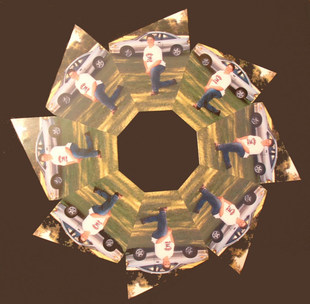
Wednesday, September 20, 2006

the dying day


to add to the beautiful sunrises that i've been taking pictures of, here is a picture of the sun setting into the clouds in the west. the sunflowers that are left in the garden are silhouetted against the sun, but the sunbeams coming from the cloud cover really add to the pretty scene.

almost every evening, jerry and i walk out and check the garden and walk around the yard together. this night, jerry yelled in for me to bring my camera out w/ me and this was what i found waiting on me. he definitely has a good eye for what looks pretty.

Tuesday, September 19, 2006

the purple heart

this drawing just started out as a stress-relieving doodle session. i had no idea of where i was going w/ the design or what i was going to do w/ it -- i just wanted to color/create something and have some time to think about things. i went to my (our) bedroom, got out the colored pencils and my journal, and started doodling.

i worked slowly, thinking about the shapes and what would look good and coloring in the solids to look consistent. not because i couldn't work faster, but because i needed something to occupy my time so my mind could think things through. i wasn't in a hurry to create, just creating to channel/focus some energy.

i ended up working on the design over about 4 sessions, and on the 4th session decided that i should "square" up the design to a nice square or rectangle shape so that i could print it on the front of a note card. i started "squaring" in one direction and then in another, but when i turned the page the other way to work i saw "h-m-m-m, that makes an almost perfect V on the bottom of a heart."

so at that point, after the whole bottom half and the middle section clear up to the inner point was done, i decided to make the doodle into a heart shape. i traced the point of the heart as i had done it on to typing paper and cut that out. then i folded the paper in half and cut the rounded parts for the tops of the heart so they would be symmetrical.

i lightly traced the outline of the upper part on the paper and then doodled in the same style shapes until i had reached those boundaries. once i saw where i was going w/ it, i was obsessed w/ getting it done and seeing the final product. funny thing, i wouldn't have ever thought to make that into a heart shape from the beginning -- but it works.

this picture was done w/ a purple prang colored pencil on white 10 x 10 journal paper w/ the consistency and texture of heavy cardstock.

several people have commented on this "doodle," which ended up being almost 10 x 10 inches when finished -- so it's a rather large "doodle". the edges of the heart were a little crimped b/c i ran out of paper! the size does explain some of the intricacy, b/c if it were only a tiny doodle -- that would be some small work!

Monday, September 18, 2006

another beautiful sunrise

another in my growing collection of beautiful sunrises and sunsets. this is a farm scene silhouetted against the rising sun that i often enjoy seeing on my way to work. on this cool, crisp morning, i decided to stop and snap a few shots of it.
unfortunately, those ugly distracting power lines in the forefront really detract from the picture. so i cropped the picture to get rid of those and force the focus on the tree and barn and bins against the rising sun. as i studied the picture more, though, i saw that there were power lines in the far background, but just in the lines of the tree and barn and bins.
by enlarging the picture to work on individual pixels, i touched out the power lines by using the eye dropper tool to match the paint to the color nearest the lines. it was a slow process, but the more i worked on it, the more sure i was that i wanted those lines out of there.
with the power lines out, the farm against the rising sun set a clean silhouette that i thought was just beautiful. i used this print to have postcards made for my september postcard swap, so if you're on my list -- this picture will be arriving soon.
next, i wanted to shift the focus from the overall scene to the beautiful old tree on the left. i recropped the picture to just include the tree and part of the old barn, and i think it turned out very well. it certainly changes the feeling of the picture for me.

i love traveling around and looking at old barns/houses/churches. i find them fascinating in the history that they have to tell.

jerry's bins at sunrise


last year, jerry and i often rode to work together. this meant that he had to leave 45 minutes earlier than normal and i had to leave 30 minutes earlier than normal, but we did enjoy our time together in the car. by carpooling, we had about an hour and a half together that we didn't normally have.

because of the times of our morning drive, we were usually driving into the sunrise. we joked that it must be our ages, but we really enjoyed the beautiful sunrise scenes and the animals out in the mornings.

one day when i was driving to work alone, i had the chance to stop and photograph this beautiful sunrise of "jerry's bins". no, they're not really "his," but he always comments on how pretty it was to see them silhouetted against the rising sun. so this day provided me to perfect opportunity to stop and take a picture of that beautiful sunrise to save for him.

crucifix - picture transformation

all of this . . .

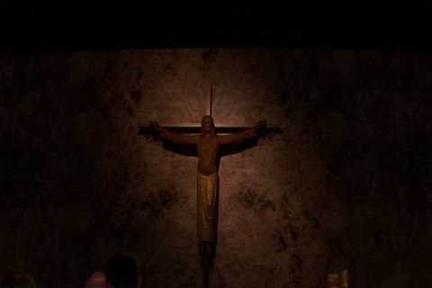
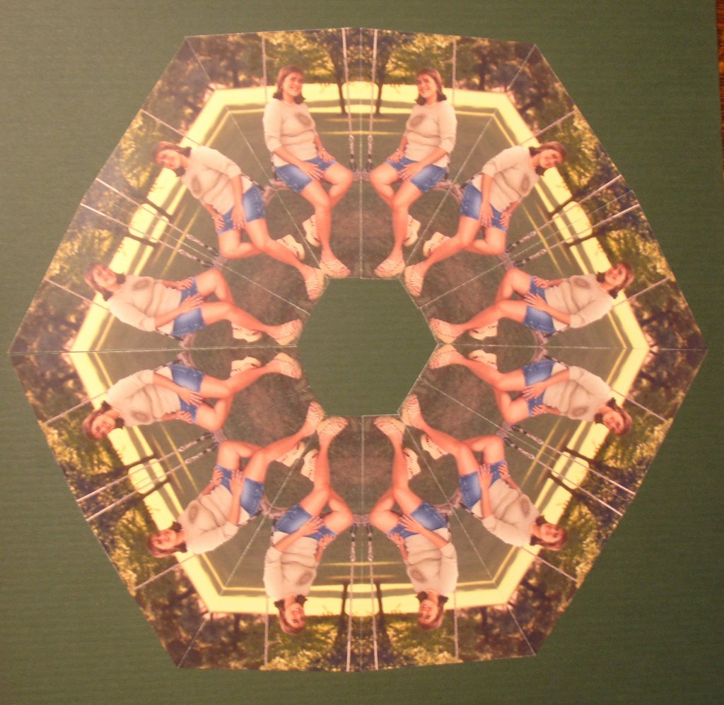
came from this . . .

last summer, my son (scott) went to a wedding in kansas city with a friend. he saw this crucifix there and thought it was just an eye-catching beautiful piece of art -- so he took a picture to show me how neat it looked.

i did have to agree w/ him -- it does have a fascinating, eerie appeal to it. something that just makes you stop and take a look at it to see what it truly is. the problem w/ the picture for me, though, was that it had some distracting elements in it -- the dark color of the roof, the head in the front left, and something else in the front right, taken at an angle from a distance, and it was too dark.

i asked him if he cared if i tried making some changes to it and cleaning up some of that outside, distracting stuff. he thought that would be fine, so i gave it a try.

i added some light to the picture before i cropped in closer on the crucifix, leaving out the line of the room and part of the outer distractions. next, i tilted the picture just a little so that the crucifix was vertically straight. after tilting, i had to re-crop the picture to have straight lines on the edges.

i enlarged the picture on the computer screen to where i could easily see the individual pixels. i used the eye dropper tool to pick up colors of the picture to "paint" out the distraction on the lower right and keep the marbled look of the wall continuous.

because he took the picture from the right side, there is more light or showing on the right. i wanted a totally symmetrical look, with the same amount of light on each side as if he were looking at the crucifix from straight on when he took the picture.

i used the freehand "select" tool and traced around the wall space on the right, copied it to another image, chose the "mirror" button to reverse it, and finally copied/pasted it back onto the original on the left side of the crucifix -- so the light looks the same on the left as on the right.

i wanted to make sure there were no obvious lines from the copy/paste step, so i used a large, soft brush to blend the areas where the lines could possible be showing.

i decided to add just a touch more light to the picture to bring out the reflective qualities in the wall colors.

almost done, i recropped the picture to make sure that the crucific was the absolute center of the picture. then, to put more emphasis on the cross and the center of the picture, i chose to add a glow from the center, which automatically darkened the upper corners and emphasized the oblong circle around the cross.

when i was done, i was VERY happy with the outcome. the picture resolution of this photo is high enough that is can easily print out at 20 x 30 poster size or print on canvas. i think it would make a beautiful picture to hang for display or a nice post card or greeting card. scott and i have talked about listing it for sale, but haven't decided where to post it.

this picture is registered as part of the original artwork of my son's collection. i'm posting it on MY blog b/c of my work on "fixing" the picture that he took, but i'm giving him full credit for the picture.

Monday, September 11, 2006

photo kaleidoscopes

here is a picture of raven sitting in front of our flowers out front of the house. we were taking pictures, so i just snapped one of her. i've been thinking to make her a kaleidoscope from a special picture, but just hadn't come across the right picture yet. when i saw this one, i knew it was "the one"!

so, i "reversed" the picture to make mirror images. then with a protractor, i figured out what angle i wanted to use to make the pictures connect where i wanted the connecting points. this turned out to be 30 degree angles, meaning that i would need a total of 12 pictures at that angle to make up the 360 degrees in a circle. of the 12 pictures, 6 must face left and 6 must face right.

i always order a couple extras of each pose in this situation, too, just in case i goof up on one. i know i can always order an extra if i need it, but the colors won't always be the same if it's printed off at a later date -- so i always just order 1 or 2 extra of each pose needed. if i don't need it for this project, i can always use it on a regular scrapbook page later OR cut it up and use it to make a mosaic picture or a border around the edge of the page of the kaleidoscope.

after measuring the angles and marking the pattern picture, i began matching that pattern up on all the other pictures. it's quite time consuming and a person must work very precisely so the angles match up exactly when finished.

here is the resulting kaleidoscope, made up of 12 - 4 x 6 pictures cut at 30 degree angles. after cutting all the pieces, i matched the pictures to a piece of 12 x 12 cardstock, measured it and marked a 4 inch X across the middle to give me good guidelines to work from. then i just started matching them up and sticking them down.

here is a picture of my son, scott, 4 years ago when he got his new car. i used this picture of him to make a pinwheel rather than a kaleidoscope b/c i didn't feel this picture would have good "touch points". it turned out to be a good thing, though, as he likes to have something different than his sister.
by taking this picture and having 8 prints made, i measured the pattern and cut the pictures all the same. then i just started laying the out and sticking them down, resulting in a perfect pinwheel pattern when i was done.
this is a kaleidoscope made from a picture of summer sitting in a wooden/rope swing. i used 30 degree angles on these pictures, requiring a total of 12 pictures w/ 6 facing left and 6 facing right. on these, i left the back part of the picture in the shape of the protractor and trimmed off a little of the picture at the 30 degree angle end.
these are all on 12 x 12 cardstock and are included within the specific person's scrapbook. they would make great framed pictures for display on the walls, but i wanted them in the scrapbooks.

now i just have 1 child and 4 grandchildren to go before i'll have one of these done for everyone in my family.

give thanks - 2005

this journal page is something that i doodled the border on while waiting on raven to get out of the emergency room the evening after thanksgiving last year. she has trouble w/ "nurse-maid's elbow" and has had about 3 trips to the ER to have her arm "fixed."

the pages were already painted w/ cheap acrylic paint. the border and writing was done w/ a brown sharpie marker, and then i added the pictures in from 2005 of the people/events i was most thankful for.

upper left - jerry and me at the kansas city countryclub plaza on thanksgiving evening to watch the lights come on.
upper right - summer and lucas pose as bride and groom, the weekend before thanksgiving.
middle left - scott gives me a hug at the plaza
middle - raven dressed up like a fairy princess at summer and lucas' wedding.
middle right - raven picks out her pumpkin w/ summer, just 2 hours after the kids and i had been rear-ended in our car by a trailer truck.
lower left - raven concentrates on painting her christmas ornament at 'clay cafe' at mall of the great plains in olathe, kansas.
lower right - the view of a beautiful sunset from my house.