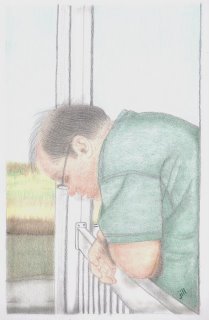
latest drawing attempt
this is a drawing that i did of jerry, my husband. while he might look like he's in deep thought, he's really just checking out the flower garden right below the front porch. he was leaned there on the railing taking a break from playing w/ the children (22, 22 & 26) and the grandchildren (5, 3, 3, 16 months and 4 months) in the front yard. after a good deal of kickball/soccor, tag, chase, ride/pull the wagon, and ride the lawnmower (or in the lawnmower wagon) -- it's exhausting for everyone!!!
i'm trying to force myself to learn and practice the fact that every single detail does not have to be in the picture to make the picture look realistic. for example, in this picture, the background is just blurred together to help put the focus on jerry in the foreground. my normal tendency would be to try to accurately include every weed and bean stalk in the background. while doing that -- i've often messed up my whole forefront drawing b/c i just couldn't fit it all into one piece! also, instead of including every single detail on jerry, i tried to focus on getting the essence of his personality instead.


this drawing was done in a 9 x 12 sketchbook w/ 70# white paper and prang colored pencils, sprayed w/ matte finish sealant to keep it from smearing.
i'm trying to force myself to learn and practice the fact that every single detail does not have to be in the picture to make the picture look realistic. for example, in this picture, the background is just blurred together to help put the focus on jerry in the foreground. my normal tendency would be to try to accurately include every weed and bean stalk in the background. while doing that -- i've often messed up my whole forefront drawing b/c i just couldn't fit it all into one piece! also, instead of including every single detail on jerry, i tried to focus on getting the essence of his personality instead.


this drawing was done in a 9 x 12 sketchbook w/ 70# white paper and prang colored pencils, sprayed w/ matte finish sealant to keep it from smearing.


19 Comments:
Jill I think you're on the right track by narrowing the focus on Jerry. Another thing to try would be to darken the background (invent it) so there's a contrast of values. That would put the emphasis on him also.
It's hard to not draw details when you are using a fine pointed pencil. To suggest more you might want to experiment with drawing with a flat carpenter's pencil, for example, or other softer leads that allow a range of values. More contrast generally puts extra zing in a picture.
Keep up the good work!
I think you did an excellent job on this....it's very soft and gentle, and it definately conveys the easy mood of the moment. The focus of the subject is right on....very nice work!
I think it's great but would probably change the background slightly, to focus that bit more on Jerry.
When I want to focus on the subject of of a photo, I often leave the subject in colour and the background in B&W (or sepia, or any monochromatic colour of your choice)
You've captured the mood - it's gives a wonderful sense of peace and tranquility.
Jill, that's a beautiful drawing! I don't think you need to do any more with it.
But you got good hints to even push it further. One thing I try to get objects more into focus and more in the foreground is to watch the edges. Smooth edges for background, harder edges with more contrast at the parts that are closest to the viewer or the parts you would like to have the focus on.
Jill....I don't have any background in drawing but I do know your subject and you did capture your subject....just one of your supporters.
WOWZA!!! I LOVE the composition and the mood you've set!!
Looks great, Jill! I struggle with trying to put in every detail, too ... I need to work on that. I have no advice for you since I'm still learning myself, but I appreciate the other's comments, especially about contrast between foreground and background. Always learning!
I love this drawing! You have created a loving mood of DH and did a great job. As Karen said, more contrast would be good, but I really like it the way it is. In fact, I think you should frame it and give it too him at Christmas.
Fantastic sketch to always remember that busy, exhausting and fun day! I was tired just *reading* your description. You got excellent suggestions here on background too. nicely done!
You might try leaving the background fuzzy and darkening the foreground (IE Jerry). Making the edges crisp on the figure and using darker colors for more contrast would make him pop out, and is in keeping with the whole "atmospheric" perspective idea.
I LOVE that you said you did something different than you normally do. And I think you are on the right track, composition wise, leaving out background details. We get to make the choices-it's not a photograph, it's a drawing!
I think he would love something like this for Christmas. It's a really good piece and it totally captures the attitude of the day!
jill
thank you, i love the drawing you did of me. thank you and love you with all my heart. Jerry
Wow -- great portrait! I wouldn't change a thing. I like the idea of making copies and giving them to your children for Christmas presents -- what a treasure they would be!
Great job Jill, lovely picture.
The drawing has been made beautifully. I might make Jerry stand out a bit more from the background with a little bit more color on him leaving the background lighter. That may not feel right to you. It is truly lovely as is too. And thanks for driving home the idea of simplifying from the reference.
Wow! This is wonderful!!
beautiful. You did a wonderful job of portraying the mood. All the suggestions were great...for another drawing! Leave it as it is! That's my vote anyway!
I agree about leaving this one AS IS - it's superb!! IMHO, the whole piece is high key and if you darken his clothing too much it might look disconnected from the surroundings. Just an excellent job and one to find the perfect mat and frame for!!
Checking past emails....this is absolutely fabulous...awesome job!
Post a Comment
<< Home