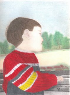
updated picture - jimmy on the train
okay guys -- after several great suggestions and ideas on what to do to make jimmy's picture better, here's what i have to show for it. i darkened in the background and created it over completely behind jimmy's face. that seemed to make a huge impact on seeing exactly where his nose and chin ended. overall, i'm MUCH happier w/ this picture now that the change is made.

i've also included the actual reference photo used for this drawing. not so much so you can see how well i did compared to the photo, but to show how "tied" i was to putting the background in just as it was in the picture. in the real photo, it truly does look like the tree and shrubs have "allowed" room for jimmy's nose and chin to interfere in their space. i also added a little more shading behind his jaw line -- maybe too much -- but i'm going to wait and see how i like it and if others comments on it.


summer took this picture on the way to the pumpkin patch, but i've alwasy been drawn to it as if there were some ethereal feeling to it. trust me, though, there was nothing any more angelic about this little demon today than there was any other day -- making him fit right in with the other little demons present!

i've also included the actual reference photo used for this drawing. not so much so you can see how well i did compared to the photo, but to show how "tied" i was to putting the background in just as it was in the picture. in the real photo, it truly does look like the tree and shrubs have "allowed" room for jimmy's nose and chin to interfere in their space. i also added a little more shading behind his jaw line -- maybe too much -- but i'm going to wait and see how i like it and if others comments on it.


summer took this picture on the way to the pumpkin patch, but i've alwasy been drawn to it as if there were some ethereal feeling to it. trust me, though, there was nothing any more angelic about this little demon today than there was any other day -- making him fit right in with the other little demons present!


5 Comments:
I did not notice the chin thing until I read the previous comments. It does look better now. It is still beautiful and now even more so. I like what you did with the landscape as well.
Great work!
Wow, nicely done - I liked your original drawing too but I agree that a little bit of change has made it much better. Love the quality of the ribbing in the sweater - so much detail. Beautiful!
Looks great! I thought the original was pretty good, but this is fantastic!!!
I liked the first one but this one's even better!
I like the new version better. I would like to see a little more shading on his forehead and back of neck. The sweater is shaded subtlely, and it seems there should be some on the face. But don't overdo it.
Post a Comment
<< Home